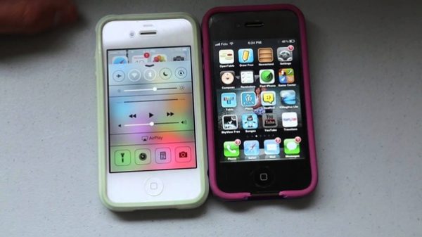
From a user interface point of view, the iPhone has carved out a unique niche for itself, with its reliance on a minimalistic design that boasts a single button, the iconic iPhone home button. The advent of the iPhone in 2007 introduced the world to the marvels of a versatile utility button that could perform multiple operations with a tap, a double tap or a long press.
Over the years, the iPhone home button has evolved from its limited function of merely taking you back to the main screen into something much more dynamic and task-oriented. The development of iPhone iOS has majorly contributed to these enhancements.
Detailed Look at the iPhone Home Button
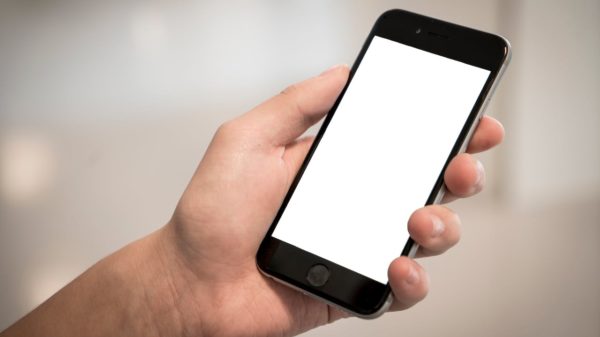
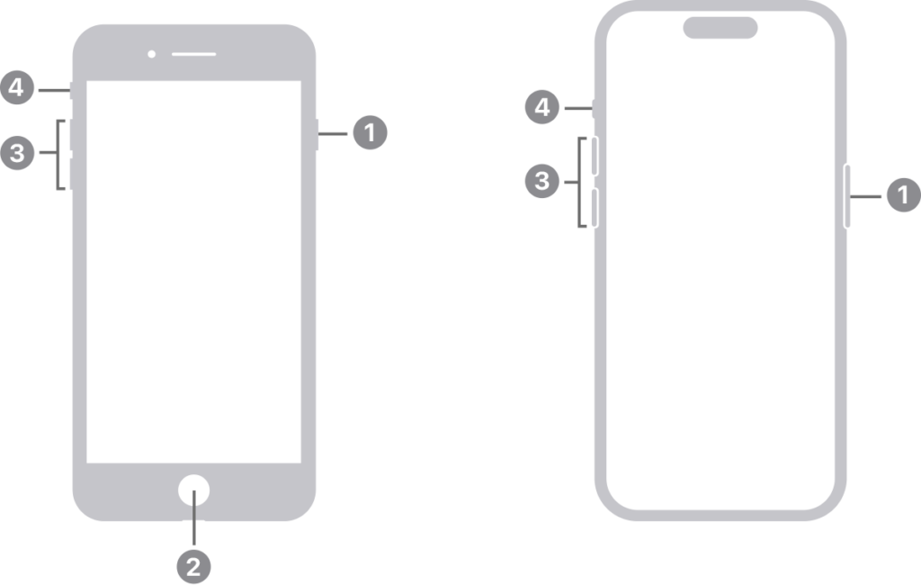
The iconic iPhone home button, marked by its distinctive square-within-a-circle iconography, stood as a beacon of Apple’s design philosophy through multiple generations of the device, from the original iPhone up to the iPhone 8. It was more than a button—it was an integral part of the iPhone experience, providing a satisfying click upon each press, thanks to its mechanical nature.
This home button was an essential feature, playing multiple roles in the functionality of the iPhone. Not only did it serve as a way to wake up the iPhone from its slumber, but it also worked in conjunction with Touch ID to unlock the device. Beyond these basic functions, it was an essential navigation tool that allowed users to quickly jump back to the home screen or juggle multiple tasks by flipping through active applications with ease. Its utility was a stark contrast to the simplistic, unassuming design that characterized its outward appearance.
Primary Function of the Double Tap
A double-tap of the home button on legacy iPhone models was a shortcut to a key multitasking feature known as the App Switcher. This double-tap action became second nature for many, revealing a carousel of apps that were recently opened and allowing users to quickly hop between them. With a light double-tap, the App Switcher would spring to life, shrinking the currently active screen and displaying other open apps as manageable cards that could be navigated with a swipe.
Within the App Switcher, switching from one app to another was as simple as tapping on the desired app’s preview. For apps that were no longer needed, a swipe upward would fling them off the screen and close them, which could also aid in managing the iPhone’s memory and processing power.
Additional Functions Triggered by a Double Tap
The versatility of the home button’s double-tap functionality extended into other convenient uses. For those who utilized Apple Pay, a double-tap on the home button became a speedy shortcut to their digital Wallet, facilitating quick payment transactions without the hassle of navigating through the device’s interface.
For users deep within the layers of apps and folders, the double-tap was a quick teleport back to the familiar ground of the main home screen, bypassing what would otherwise require multiple single taps. It was an intelligent design feature that underscored Apple’s commitment to user-friendly interfaces.
Additionally, for users operating their device with one hand, the Reachability feature was a godsend. Activated by a light double-tap on the button, it brought the top of the screen within thumb’s reach by sliding down the screen contents, which was particularly useful on the larger iPhone models.

Customizing the Double Tap Function
In line with Apple’s ethos of providing a personalized user experience, the iOS allows for the customization of the home button’s double-tap speed. Within the ‘Settings’ app, under the ‘General’ section, users could tailor the sensitivity to their own preferences.
Furthermore, through the ‘Accessibility Shortcuts’ found in the ‘Accessibility’ settings, users were given the power to redefine what a double-tap could do, like enabling AssistiveTouch or the Magnifier. This flexibility in customization catered to users with different needs and preferences, making the iPhone experience more inclusive.
Troubleshooting and Fixes for the Double Tap Function
As with any physical component, the iPhone’s home button was not immune to wear and tear or technical hiccups. Issues could range from a lack of responsiveness to irregularities in activating the App Switcher or other features tied to the double-tap.
When facing such issues, users could try several solutions, like rebooting the iPhone, ensuring the iOS was up to date, or performing a settings reset through the ‘Settings’ app. If these steps failed to resolve the problem, a visit to an Apple Store might be necessary for a professional assessment and, if required, repairs.

Evolution of the Home Button: From Physical to Virtual
The iPhone X marked a dramatic change in the design of the iPhone by discarding the physical home button in favor of a fully touch-screen interface. This change introduced users to a new way of interacting with their devices—a virtual or gestural home button.
To awaken the device or to go to the home screen, users now simply swipe up from the bottom edge of the screen. This gesture replaced the need for a physical button, signaling Apple’s move towards sleeker, button-free device designs and enhancing the user experience with a more intuitive set of gestures for navigation and access.
Conclusion
Mastering iPhone functionalities can throw open doors to optimal user experience and seamless, efficient iPhone usage. Exploring, learning and becoming adept at these features, such as the double-tap function on the home button, can enhance interactions with our iPhone and make it a much more personalised companion.
Whether it’s multi-tasking through the App Switcher, quickly accessing Apple Pay, returning to the home screen, or one-handed operation with Reachability, the benefits of double-tapping are plenty. And with the advent of newer iPhone models, this efficient interaction only improves, transforming the way we view and utilize telecommunication devices.


